Winning By Design: Document Layout Essentials
The best proposals won't win if they aren't read. If your tender preparation looks inviting and professional it goes to the top of the pile. Along with your chances of winning.
KEY POINTS
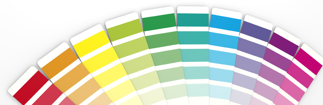
- Professionally-designed layouts will let your content come alive
- Using a document grid creates order and relieves reading fatigue
- Design your document with the end reviewer in mind when considering binding, margins and formatting
A professional layout may put your submission on the shortlist
Spare a thought, for a moment, for the reviewers of our tender submissions. Often, they are under-resourced and time-poor. Can we blame them for reducing the pile of proposals to a shortlist as quickly as possible?
The tragedy is that many brilliant proposals never make it to the key decision makers. When a tender response is poorly laid out or difficult to read, it may end up in the 'reject pile' early - even if the content is persuasive.
On the other hand, an easy-to-read document that looks and feels like a trade journal often gets read first. A polished, considered layout says to the reviewer: "this company is professional, stable and confident about their offer."
So what makes a professional layout?
Packaging the Content Beautifully
Every proposal starts life as a blank page or screen, and the words, pictures and information live within the page structure. Importantly, your layout has the power to either suffocate your content, or allow it to flourish in the reviewer's mind.
The sample below shows the elements of a professionally-designed tender submission document.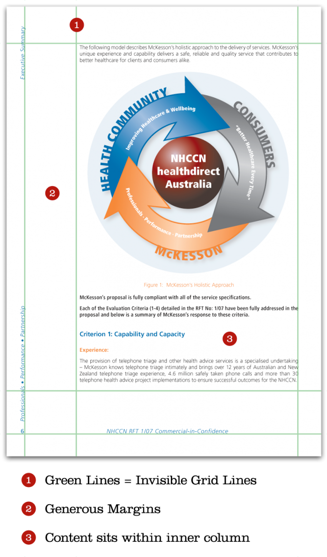
Giving Your Layout Function and Form: The Grid
Just as every building has a foundation, every page layout has an underlying framework of margins and columns, called the document grid. Although invisible itself, the grid creates order and unifies the elements on the page.
Newspapers, magazines and books are all based on grids, and a reviewer subconsciously associates a well-laid out tender submission with publications of that calibre.
Content laid out consistently against a grid appears solid and assured. It's pleasing to the eye. And it makes for a page which is easy to approach, read and understand.
Providing Breathing Space with Margins
The blank space around the edge of your page content is certainly not wasted paper. Reviewers nearly always use margins extensively during the tender review process for comments and queries.
But page margins also affect readability. A page with tiny margins looks full, hard to read and intimidating, but a page with plenty of 'white space' seems relaxed and approachable.
Additionally, larger page margins can be used to include pull quotes and theme statements. These can reinforce key proposal messages and catch the eye of the time-poor executive having a brief skim read.
Remembering the Reader
It's easy to focus intently on the writing of tenders and forget about how the way they will be read. Keeping the reader in mind will affect your document layout.
For example, if the response is to be submitted in printed form, you need to decide how it will be printed and bound. Depending on the size of the document, the industry and the requirements of your buyer, you may have it bound professionally with a glued spine (perfect binding), stapled, spiral bound or even hole-punched in a ring binder. In these cases, it's best to use facing pages with mirrored layouts - as in the example above. Of course, thinking ahead about the space needed for gluing or ring binding will mean that none of your valuable content ends up glued together or as hole punch confetti!
If your tender is submitted electronically as a PDF or .DOC file, it's normally best to have a single-page design. When the reviewer prints the document on an office printer, they will probably staple or clip the pages together in the corner rather than in the centre.
If you keep the reader in mind during the layout design process, you can greatly reduce their stress and improve the overall impression of your offer.
How To Do it
As you may have realised, document layout is a rather specific skill. It requires a good knowledge of basic design principles and an understanding of legibility techniques.
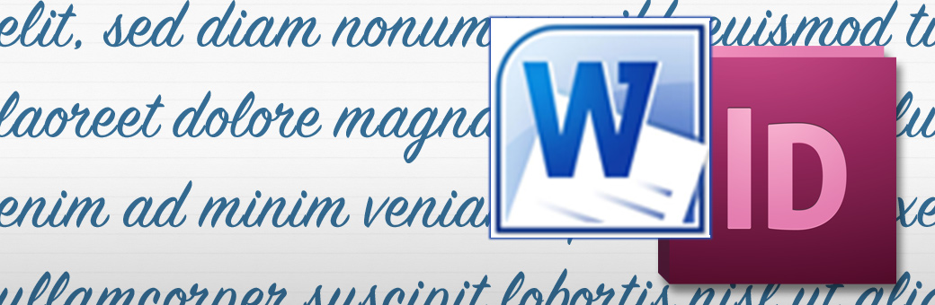
Whilst it's possible to put together very simple page layouts using a Word Processor, truly professional results depend on specialist applications such as InDesign or Quark.
Often a tender team will choose to 'work smart' by concentrating their time and effort on developing quality content and then outsourcing the final layout to a design professional. When content and layout are produced by experts they combine with impressive results.
Document layout isn't just about aesthetics. An impressive look and feel can help you make the shortlist. A well-designed layout makes the reviewer's job so much easier. Subconsciously, it gives your submission a solid, confident appeal. Most importantly, your tender document may be the prospect's first point of contact with you. If the experience is professional, client-friendly and clear, it bodes well for the future of your relationship and can give your bid the winning edge.
 Matt Milgrom is a senior consultant for Tender Success spending years helping Australian Corporations design beautiful, bid-winning tender response documents. Contact Matt to ensure your next response is a success.