The Science of Legibility: Type That Enhances Your Bid
The messenger is as important as the message. Making your response as easy to read as possible is an essential skill.
KEY POINTS
- Poor legibility muffles your quality content
- Choose Serif fonts for body text for easy reading
- Stick to between 9 and 12 point text
- Use column widths that match the natural span of the eye
- Use justification and spacing to make your paragraphs legible
The last thing you want is for your messenger to detract from your message
Imagine that your next proposal will be read to the prospect, not printed or PDF'd. What kind of reader would you choose to deliver it? Probably not someone with a breathlessly rapid delivery, monotonous voice or deeply thick accent. Why not? The last thing you want is for the messenger to detract from your message. A clear, measured reader would let the listener comprehend, absorb and reflect on your pitch.
It's exactly the same story with the written word. The way you present the body text of your document changes the way the reader absorbs the information. It is vitally important to set body text so that your persuasive words flow unhindered into your reader's mind.
It's true that legibility is something of a science. However, there are certain basic guidelines you can follow which will enhance the document design of every proposal you submit.
Typeface Choice
With headings and other large text elements, you can allow yourself some creative freedom. In fact, using a professional, corporate font with a little splash of character can enhance and humanise a formal written pitch.
However, when it comes to body text, the rule is simple: it should nearly always be set in a serif font.
Serifs are the tiny horizontal lines found at the top and bottom of letters, as shown below:
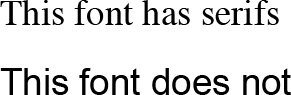
Serifs aid the reader by helping our eyes track quickly left to right along the line. You'll find that wherever lots of text needs to be digested - in newspapers, articles, novels - serif fonts are used.
Very occasionally, a response may call for the use of a serif font with obvious elegance such as Didot, Bembo or Garamond. However, as obvious and cliché as it may sound, often good old Times Roman is the perfect font choice for maximum legibility. It's ubiquitous so it feels safe, comfortable and neutral.
Whatever font you choose for your body text remember that contrast is everything: only ever use black text on white paper. Colour within body text slows reading significantly, so add emphasis using bold or italic.
(TIP: If you know your proposal will be read only on screen, the Georgia font should be your default choice as it's designed specifically for easy screen reading.)
Font Size
Proposals will usually be printed on A4 paper and read from a distance of 30-50 cm. It's widely agreed that for the majority of readers, body text should be sized between 9 and 12 point.
Many decision-makers are experienced executives who will not appreciate having to strain their eyes to read the details of your offer: smaller typeface sizes can try the patience of near-sighted reviewers.
On the other hand, overly large type quickly becomes less comfortable to track visually and can even create eye fatigue whilst reading.
Column Width
Newspapers use columns in their layouts for good reason: a reader's natural eye span is relatively narrow. Using very wide columns in your proposals affects legibility negatively in two ways:
- The reading flow is interrupted for a long time as the reader's eyes move from the end of one line to the start of the next.
- Long line widths make it easy for a reader to miss a line, or return to one they've previously read.
Ideal legibility calls for around 8 - 10 words per line. This is why content-heavy publications such as company profiles and annual reports often use two columns per page. These layouts make effective use of the page real estate without sacrificing legibility.
The size, content and nature of your proposal will dictate whether to use two columns for your body text, or to combine larger margins with professional page layout design.
Paragraph Justification
The principles of legibility allow for only two kinds of justification and alignment:
Left aligned
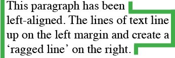
Lines of text sit square with the left margin and create a ragged edge on the right.
Narrow columns with larger font sizes work best when left aligned: justified text can appear 'gappy' and may affect legibility negatively as readers have their reading rhythm interrupted.
Justified
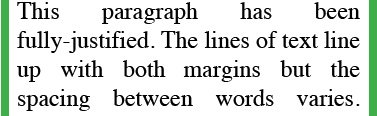
The lines of text have variable spacing line by line so that the text runs flush from left to right margins.
Larger columns of smaller text look ordered and attractive when fully justified.
Either option allows the eye to jump easily from line to line.
It may sound obvious, but centred text should never be used for body text.
Paragraph Spacing
Generally, a change of thought in your body text calls for a new paragraph. This provides an opportunity for the reader to pause momentarily, reflect on what they have absorbed and prepare to read on.
Adding space between paragraphs reinforces this pause and allows some eye relief as the reader moves between thoughts. Paragraph spacing also aids overall legibility and comprehension.
Generally, between 2-3pts of spacing will be enough to give your type breathing space and a professional feel.
 A muffled messenger is as bad as a weak message. Why spend hours writing a persuasive response if it won't be received with crystal clarity? Making a tender response legible requires a little forethought and discipline, but your content is worth it. When done properly, your pitch will flow from the page to the reader's mind as if dictated by a polished narrator.
 Matt Milgrom is a principal consultant for Tender Success and has spent years crafting highly legible professional proposals for Australian companies. Contact Matt to ensure your next response is a success.